Since we got a first look at
a Container Queries prototype
back in April 2021,
the syntax has changed a few times.
But now the spec is stable,
browsers are getting ready to ship,
and it’s time to make sure
you’re using the same syntax they are!
Update
:
Safari 16 shipped on September 12,
with support for size Container Queries and units
(and much more).
Update
:
Older versions of Safari Technology Preview
and Chrome both had a bug
requiring parentheses around
queries with logical operators (not, and, or).
Upgrade to Chrome 105 or Safari 16
to get the proper behavior.
Update
:
Chrome 105 shipped on August 30,
with support for size Container Queries and units.
Container Queries
allow us to measure (or ‘query’)
aspects of a ‘container’ element,
and style any descendants
based on the result of the query.
This is very similar to
Media Queries,
which allow us to query the overall
browser viewport.
If you haven’t encountered
Container Queries before,
there are many
resources available
on the web.
David Herron
wrote a great
Quick Start Guide
back in April 2021,
when Chrome Canary
shipped the first prototype of the feature.
Since then
the syntax has gone through several revisions.
That’s why we prototype –
it allows us to learn and make changes,
before developers are relying on the feature
in production.
The downside is,
many people (including me!) have written articles,
made demos,
given talks,
and released videos
using now-out-of-date syntax.
Now Safari and Chrome
have both signaled that
they are ready to ship
Container size queries and units,
likely starting in late August 2022.
main, .sidebar{/* establish containers for inline-size queries */container-type: inline-size;}main{/* optionally give a container one or more names *//* - use any names you want, there are no pre-defined options */container-name: main-content page-layout;}article{/* a shorthand to set both names and types *//* - names are required and come first in the shorthand */container: article-layout / inline-size;}/* query the nearest ancestor container named page-layout *//* - using a container-name is optional in the query *//* - we can also use the old `(min-width: 40em)` syntax */@container page-layout (inline-size > 40em){.card{grid-template-columns: auto 1fr;}}h2{/* container-query-inline units */font-size:max(1.2em, 1em + 2cqi);}
If you are looking at an old demo,
talk, or article,
and wondering why it doesn’t work,
there are two major changes
that you should check first:
In order to query elements in the page,
we need to define them as query containers.
We can do that with the container-type property,
which defines the questions we’re able to ask
about a given container.
The initial value is normal.
By default,
all elements are style containers –
meaning we should be able to query the
computed value
of any property on any element.
But don’t worry about that yet,
browsers are shipping
size queries and units first.[1]
For now, you can use the normal value
to override other values –
similar to using the initial keyword.
Size containers need to be defined explicitly,
because they require special size containment
in order to function.
Normally, the size of an element
would be based on the size of its contents –
but if we query that size,
and change the contents based on the query,
we have an infinite loop.
Size containment breaks that loop
by ensuring the size of a container
is not based on the size of its contents.
Here we have two options:
inline-size establishes size containment
on the inline axis (the direction that text flows),
and allows us to query the inline size
of the container.
This is almost always what you want.
size establishes size containment
on both dimensions of the container,
and allows us to query either the inline or block size.
Be careful with this –
elements might collapse entirely
if they can’t get either a width or height value
from their contents.
There is no block-size option.
I won’t go into all the reasons here,
but it wasn’t possible for browsers to implement,
and there are fewer use-cases for it anyway.
Over time,
Media Queries have expanded
to cover much more than viewport sizing –
we can query user preferences,
display quality,
color-depth,
interaction capabilities,
and more.
We expect a similar expansion
with Container Queries.
Size queries will ship this summer,
but style queries are already well-defined,
and ready for browsers to implement.
We’re also looking into a range of possible
state queries –
for example,
selecting elements inside a position: sticky container
based on the stuck or unstuck ‘state’
of that container.
By default,
a container query will look for
the nearest ancestor container of the appropriate type.
So if we ask about the inline-size of a container,
we’ll get the inline dimensions of
the nearest ancestor with a size-based container-type.
That’s a handy default,
but it’s more resilient if we can name our containers,
and know that we’re measuring the right thing.
We can do that with the container-name property.
It allows us to give a container
any number of custom names that we want.
Those names can be any valid CSS ‘custom-ident’
that we come up with
(similar to naming keyframe animations, grid-areas, layers, etc),
and they are not required to be unique.
There are only a few reserved words –
like none or not or initial –
that we can’t use as names.
Think of container-names more like a ‘class’ than an ‘ID’.
We can make them as broad or specific as we need.
I think it’s useful to establish
some broad categories like
layout or component –
and then occasionally add more
detailed/specific identifiers as needed
(like main in the code sample above).
There’s also a container shorthand
that allows us to define both the container
types and names in a single property.
This should only be used
to set both the name AND type of a property:
main, .sidebar{/* <name> comes before the slash, <type> comes after */container: page-layout / inline-size;}
Note:
Names go first, before the slash.
This is one of the big changes
that will break a lot of demos.
In an earlier draft of the feature,
the order was reversed.
If you see an old container query
article or talk or demo
that no longer works,
this is probably why.
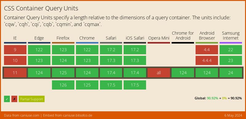
Did you know that
Container Queries
also come with their own units?
These work the same as
viewport units
(vw, vh, vmin, etc) –
but if they end up inside a size container,
they’ll use the container dimensions
instead of the viewport dimensions.
If they aren’t inside a container,
they’ll use the ‘small viewport’ dimensions.
1cqw - 1% of a query container’s width
1cqh - 1% of a query container’s height
1cqi - 1% of a query container’s inline size
1cqb - 1% of a query container’s block size
1cqmin - The smaller value of cqi or cqb
1cqmax - The larger value of cqi or cqb
Note:
This also changed
after some of the early demos came out.
The original prototype
used q* instead of cq*
as the unit prefix.
Now that we have some (size) containers defined,
we can query various aspects of their dimensions:[2]
@container(inline-size > 40em){h2{font-size: 1.5em;}}@container page-layout (min-width: 35em){.card{grid-template-columns: auto 1fr;}}
There are a few things to note here:
The optional ‘range syntax’ – e.g. (inline-size > 40em) –
is a separate feature,
which is allowed in media queries
as well as container queries.
However,
at this point,
Safari only supports it in container queries.
Each h2 and .card element on the page
will query its own container.
An h2 will query the nearest ancestor size container,
but a .card will only query ancestors
that also have the correct page-layout name.
em-based media queries use the ‘browser em’ (usually 16px),
but container-queries actually resolve units
based on the font-size of the container.
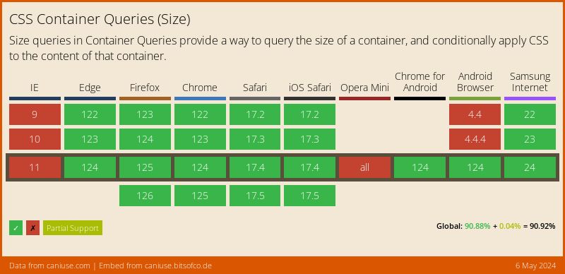
Chrome 105 & Safari 16 both
support size queries and units.
Firefox is
actively working on support,
but hasn’t yet announced when it will be ready.
Here’s the current support
for each feature:
Chrome has started to implement
a prototype of style queries
(for custom properties only)
in Chrome Canary,
using the --enable-blink-test-features
runtime (command line) flag.
Keep an eye out for more details soon! ↩︎
Check out the spec
for a full list of
size container features
that can be queried –
like aspect-ratio and orientation. ↩︎
New CSS features are shipping at an unprecedented rate –
cascade layers, container queries, the :has() selector,
subgrid, nesting, and so much more.
It’s a good time to step back and understand
how these tools fit together in a declarative system –
a resilient cascade of styles.
You are a star, thank you. I stopped for a while because I ran into syntax changes a few times and started getting confused. Looks like it’s time to open those old codepens and dive back in.
Makes sense. It’s the difficult balance of a prototype – we’re doing it to learn & get feedback & make changes, but it can also lead to confusion. But yes - it’s stable & safe now! Welcome back. :)
Completely understand, whether the wait. I turned my attention to combining Sass and Custom Properties which was rabbit hole more than deep enough to keep me busy and ended up recently reading your article on Proximity so I owe you thanks again 🙏
Welp, guess I had better learn container queries. Here I was thinking I could code things to XHTML 1.0 Strict and CSS 1.0 until I died. And since I would rather go gaming than to a dirt nap… I will read it during gaming.
If you want to start using these features (I recommend it!) just make sure you’re using the right syntax! Some things have changed between the first prototype and the final version that’s shipping in browsers.…
The three types of browser (and CSS!) magnification
byMiriam Suzanneon
I’m working on an article about fluid typography, and relative units. But instead, I fell down this rabbit hole – or a cleverly-disguised trap? – trying to understand ‘zoom’ in the browser (not Zoom™️ the software). Since I couldn’t find any up-to-date articles on the subject, I thought I shoul…
Take your time with new CSS, but don’t sleep on the essentials
byMiriam Suzanneon
Several people have asked recently why container queries aren’t being used more broadly in production. But I think we underestimate the level of legacy browser support that most companies require to re-write a code-base.