Skip to main
Link
Sass logo in black
on top of bright oklch color gradient

Sass Color Spaces (Request for Comments)

A new proposal for color management in Sass

There’s been a lot of exciting work in the CSS color specifications lately, and since the new features are already starting to land in browsers, we’ve been preparing to add support in Sass as well. My proposal for that is published and ready for public feedback!

Read the summary & proposal »

I’m very excited about the new color features starting to roll out in CSS – and similarly excited to make them available (with some extra tooling) in Sass as well. This will allow us to:

I hope to write more about color spaces here at some point, but for now check out the request for comments, or dive straight into the full proposal. If you want to learn more about color spaces in CSS, Bramus Van Damme has a great collection of resources, Chris Lilley & Lea Verou released the handy Color.js library, and all of this is based on CSS Color Level 4 and Level 5.

Safari is the farthest along in terms of browser support for the new color spaces, but this is all part of Interop 2022 – which means every browser is trying to get it done this year. I recommend installing the latest Safari Technology Preview and playing around with it!

I put a lot of work into this proposal, and I’m excited to get feedback. Along the way, I also went down a few rabbit holes. If you’re interested, check out The Gray Areas of HWB Color, or my Codepen experiments with Sass color inversion and interpolation of missing channels.

  1. Baseline Bakery: as sweet as Interop. Demo to view donut products as a small grid, large grid, or list with an optional To Go Bag sidebar.
    Link post type

    Container Queries and Units in Action

    One of the goals when writing CSS is to build component parts that will adapt well to different (and unexpected) contexts. Ideally, a component can be placed inside any “container” element without it feeling broken or out of place. How can you accomplish this in a complex layout like a…

    see all Link posts
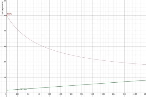
  2. A graph showing font size and zoom effectiveness versus viewport width. The font size, calculated as calc(17px + 2.5vw), increases linearly with viewport width. The 500% zoom line, representing the maximum possible zoom, shows that zoom becomes less effective as viewport width increases, failing to provide a 200% font size increase beyond a viewport width of 2040px.
    Link post type

    Responsive and Fluid Typography with Baseline CSS Features

    As designers, it makes sense to think about what space is available in the browser, and adjust your typography accordingly. It’s also important to remember that different users will have different font-size needs – and the more a font size is responsive to the viewport, the less responsive it will…

    see all Link posts
  3. Indoor plants in pots on a floating shelf
held up by brackets.
    Link post type

    Sass Indented Syntax Improvements

    Bringing SCSS flexibility to .sass files

    The Sass indented format is getting more flexible with the ability to have multiline statements, semicolons, and more.

    see all Link posts